import pandas as pd
import numpy as np
import statsmodels.api as sm
import seaborn as sns
import matplotlib.pyplot as pltData Visualization
df = sm.datasets.get_rdataset("mtcars", "datasets", cache = True).data

df.head()| mpg | cyl | disp | hp | drat | wt | qsec | vs | am | gear | carb | |
|---|---|---|---|---|---|---|---|---|---|---|---|
| Mazda RX4 | 21.0 | 6 | 160.0 | 110 | 3.90 | 2.620 | 16.46 | 0 | 1 | 4 | 4 |
| Mazda RX4 Wag | 21.0 | 6 | 160.0 | 110 | 3.90 | 2.875 | 17.02 | 0 | 1 | 4 | 4 |
| Datsun 710 | 22.8 | 4 | 108.0 | 93 | 3.85 | 2.320 | 18.61 | 1 | 1 | 4 | 1 |
| Hornet 4 Drive | 21.4 | 6 | 258.0 | 110 | 3.08 | 3.215 | 19.44 | 1 | 0 | 3 | 1 |
| Hornet Sportabout | 18.7 | 8 | 360.0 | 175 | 3.15 | 3.440 | 17.02 | 0 | 0 | 3 | 2 |
Seaborn seems to be the most efficient way to get decent looking exploratory plots in a hurry.
Line Plot
sns.lineplot(df, x = "mpg", y = "disp")<AxesSubplot: xlabel='mpg', ylabel='disp'>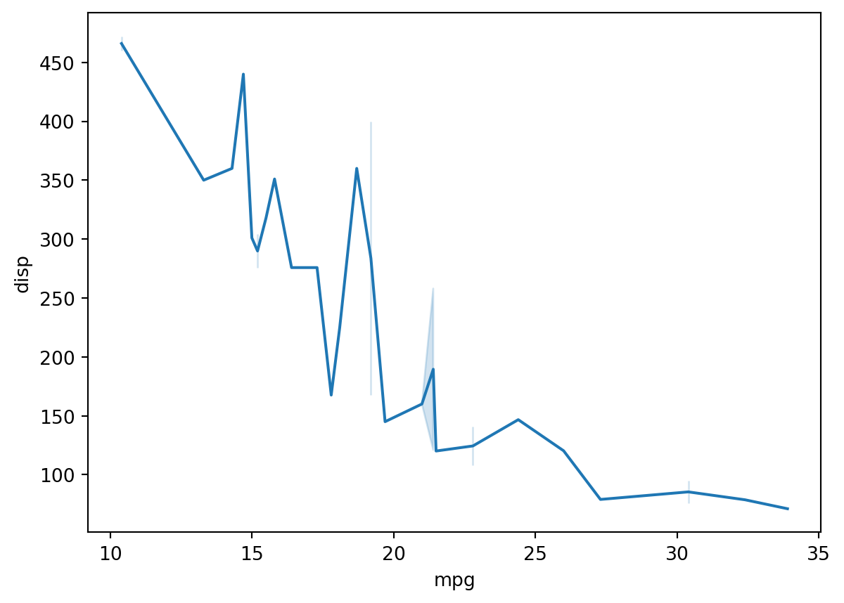
Line Plot by factor
Use the hue argument to break out factors into separate lines.
sns.lineplot(df, x = "mpg", y = "disp", hue = "am")<AxesSubplot: xlabel='mpg', ylabel='disp'>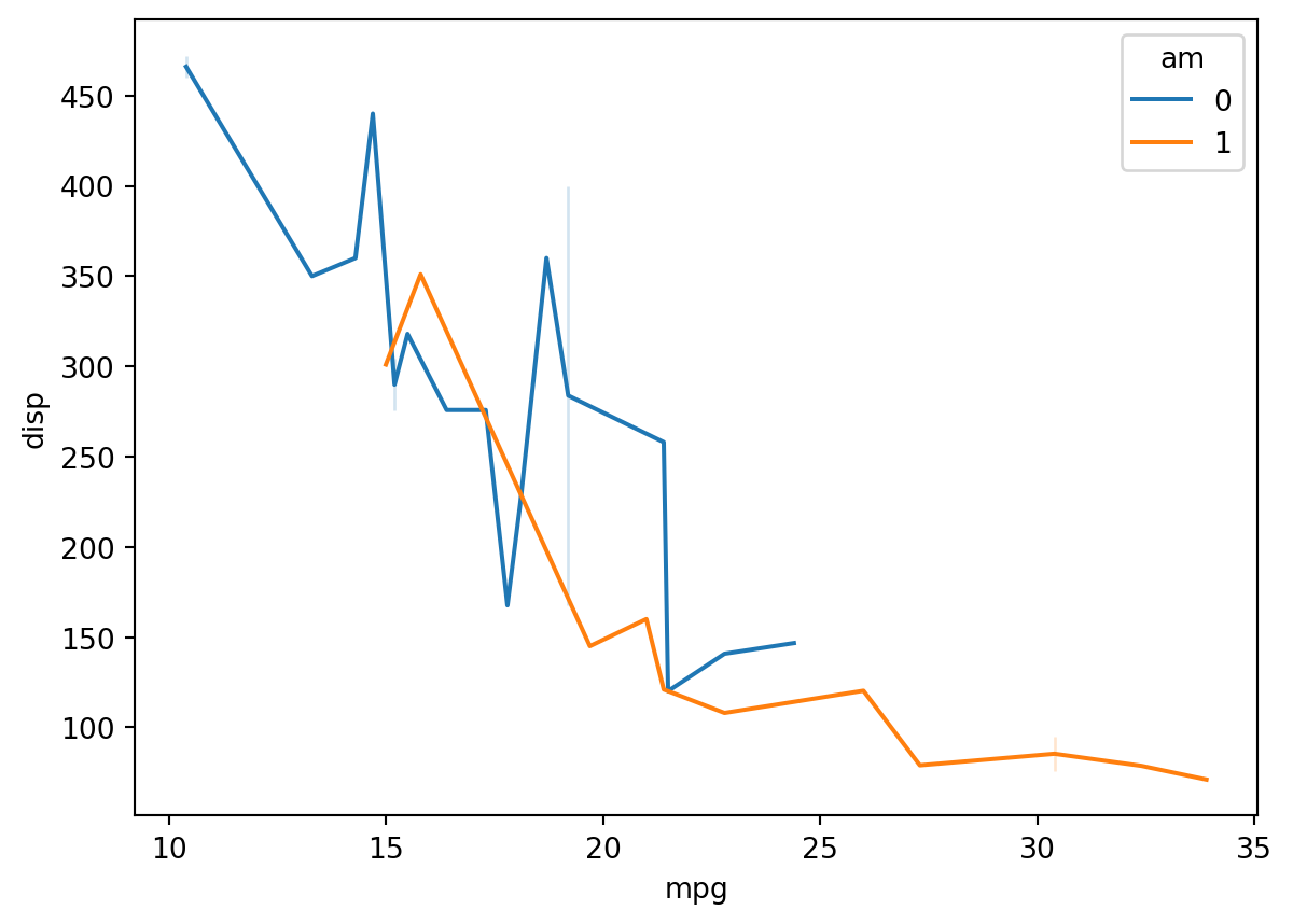
Line plot with linear trend
Mean/CI are automatic if you melt the df.
df_long = pd.melt(df, id_vars = "cyl", value_vars = "mpg")

df_long| cyl | variable | value | |
|---|---|---|---|
| 0 | 6 | mpg | 21.0 |
| 1 | 6 | mpg | 21.0 |
| 2 | 4 | mpg | 22.8 |
| 3 | 6 | mpg | 21.4 |
| 4 | 8 | mpg | 18.7 |
| 5 | 6 | mpg | 18.1 |
| 6 | 8 | mpg | 14.3 |
| 7 | 4 | mpg | 24.4 |
| 8 | 4 | mpg | 22.8 |
| 9 | 6 | mpg | 19.2 |
| 10 | 6 | mpg | 17.8 |
| 11 | 8 | mpg | 16.4 |
| 12 | 8 | mpg | 17.3 |
| 13 | 8 | mpg | 15.2 |
| 14 | 8 | mpg | 10.4 |
| 15 | 8 | mpg | 10.4 |
| 16 | 8 | mpg | 14.7 |
| 17 | 4 | mpg | 32.4 |
| 18 | 4 | mpg | 30.4 |
| 19 | 4 | mpg | 33.9 |
| 20 | 4 | mpg | 21.5 |
| 21 | 8 | mpg | 15.5 |
| 22 | 8 | mpg | 15.2 |
| 23 | 8 | mpg | 13.3 |
| 24 | 8 | mpg | 19.2 |
| 25 | 4 | mpg | 27.3 |
| 26 | 4 | mpg | 26.0 |
| 27 | 4 | mpg | 30.4 |
| 28 | 8 | mpg | 15.8 |
| 29 | 6 | mpg | 19.7 |
| 30 | 8 | mpg | 15.0 |
| 31 | 4 | mpg | 21.4 |
sns.lineplot(df_long, x = "cyl", y = "value")<AxesSubplot: xlabel='cyl', ylabel='value'>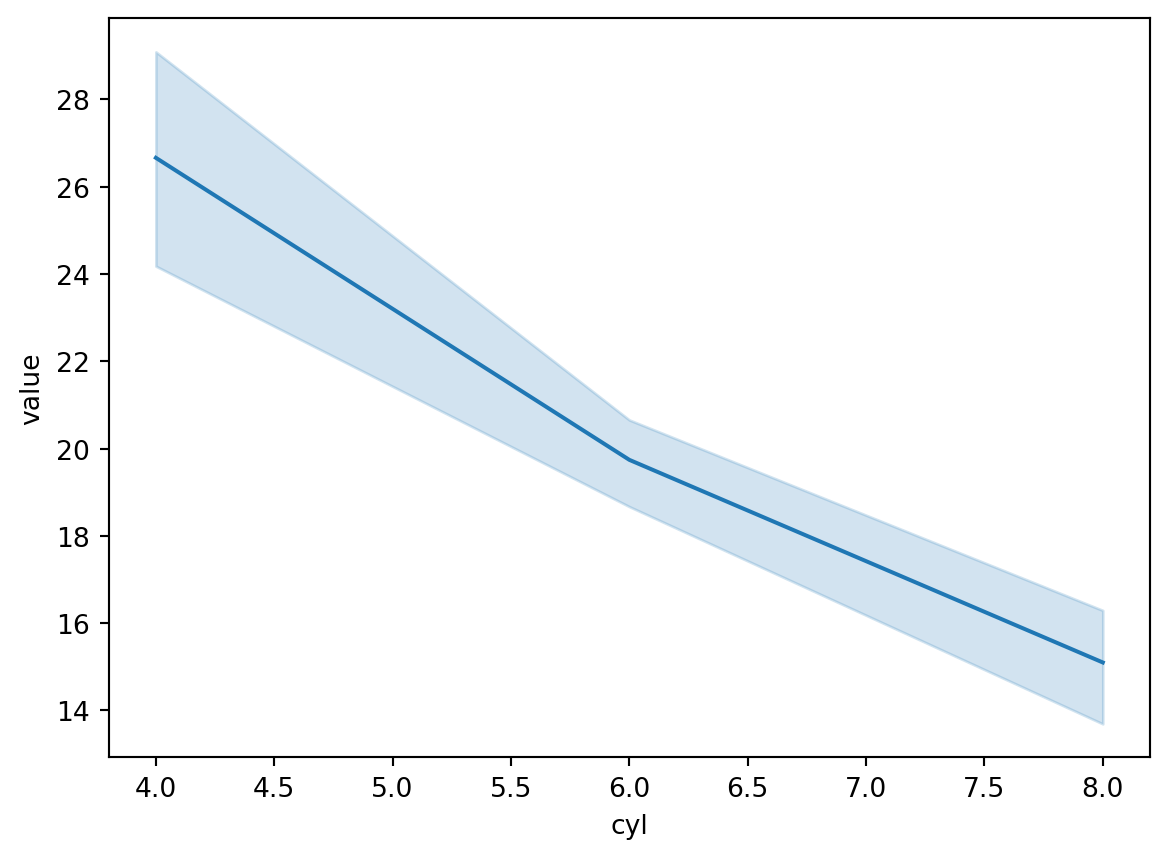
Or, use lmplot to git a linear model like you’d get with geom_smooth(method = lm).
sns.lmplot(df, x = "mpg", y = "disp")<seaborn.axisgrid.FacetGrid at 0x7f5d567270d0>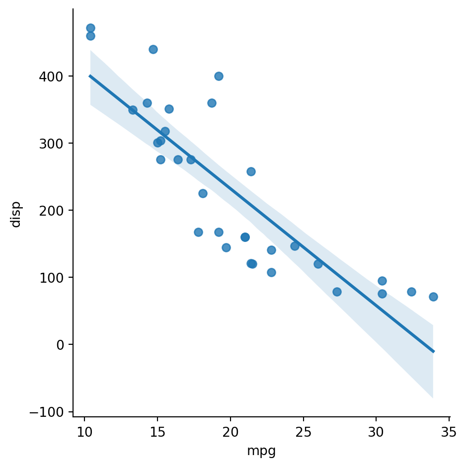
Box Plot
sns.boxplot(df, x = "cyl", y = "mpg")<AxesSubplot: xlabel='cyl', ylabel='mpg'>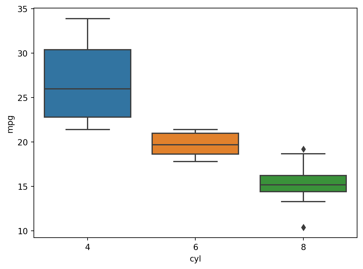
Histogram
sns.histplot(df, x = "wt")<AxesSubplot: xlabel='wt', ylabel='Count'>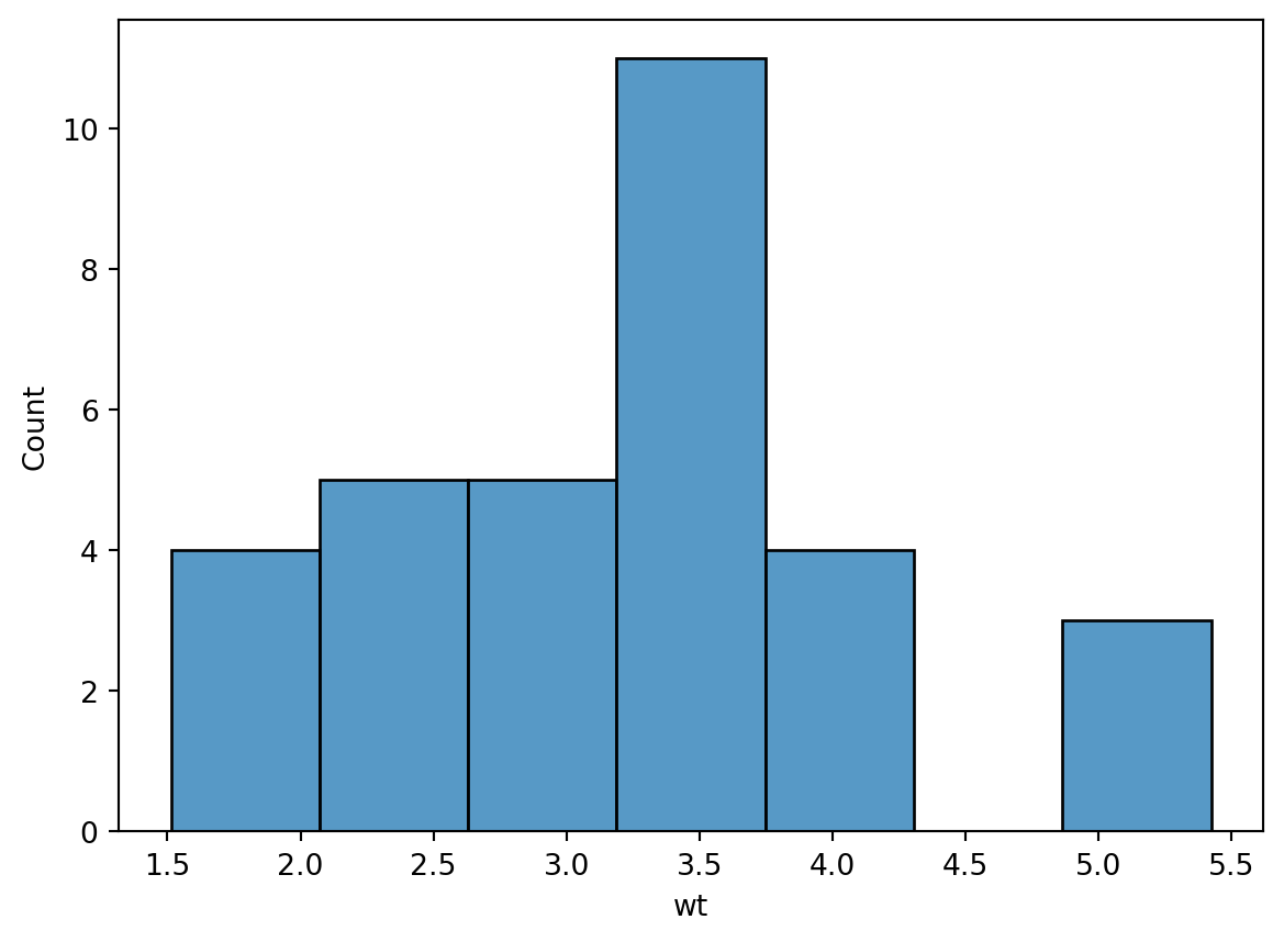
Density Plot
sns.kdeplot(df, x = "disp")<AxesSubplot: xlabel='disp', ylabel='Density'>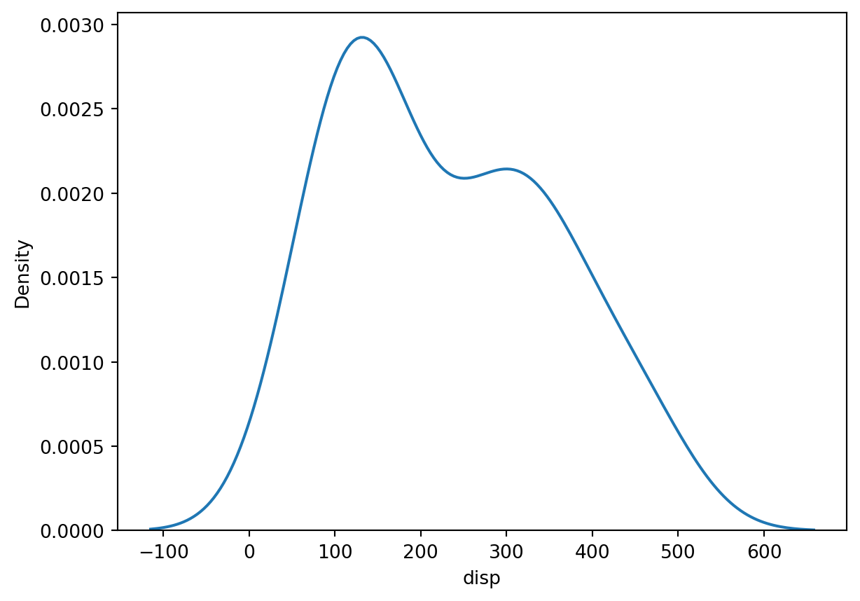
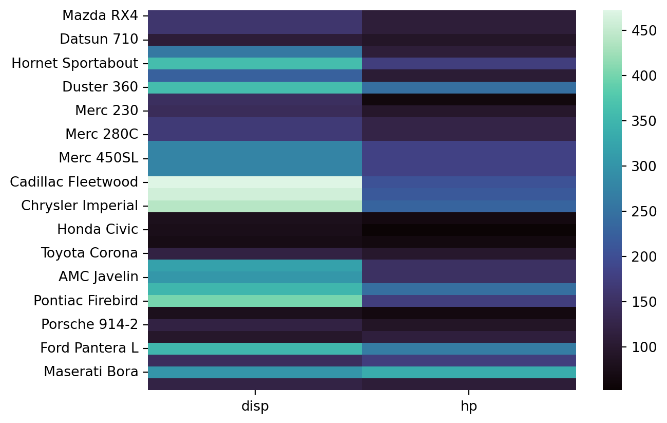
Heatmap
sns.heatmap(df[["disp", "hp"]])<AxesSubplot: >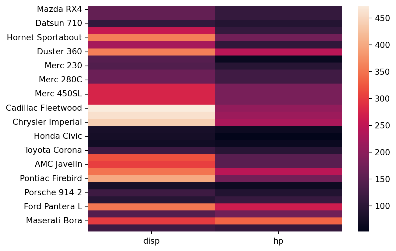
Multiple Variable Plots
KDE
sns.kdeplot(df.loc[:, ["mpg", "wt"]])<AxesSubplot: ylabel='Density'>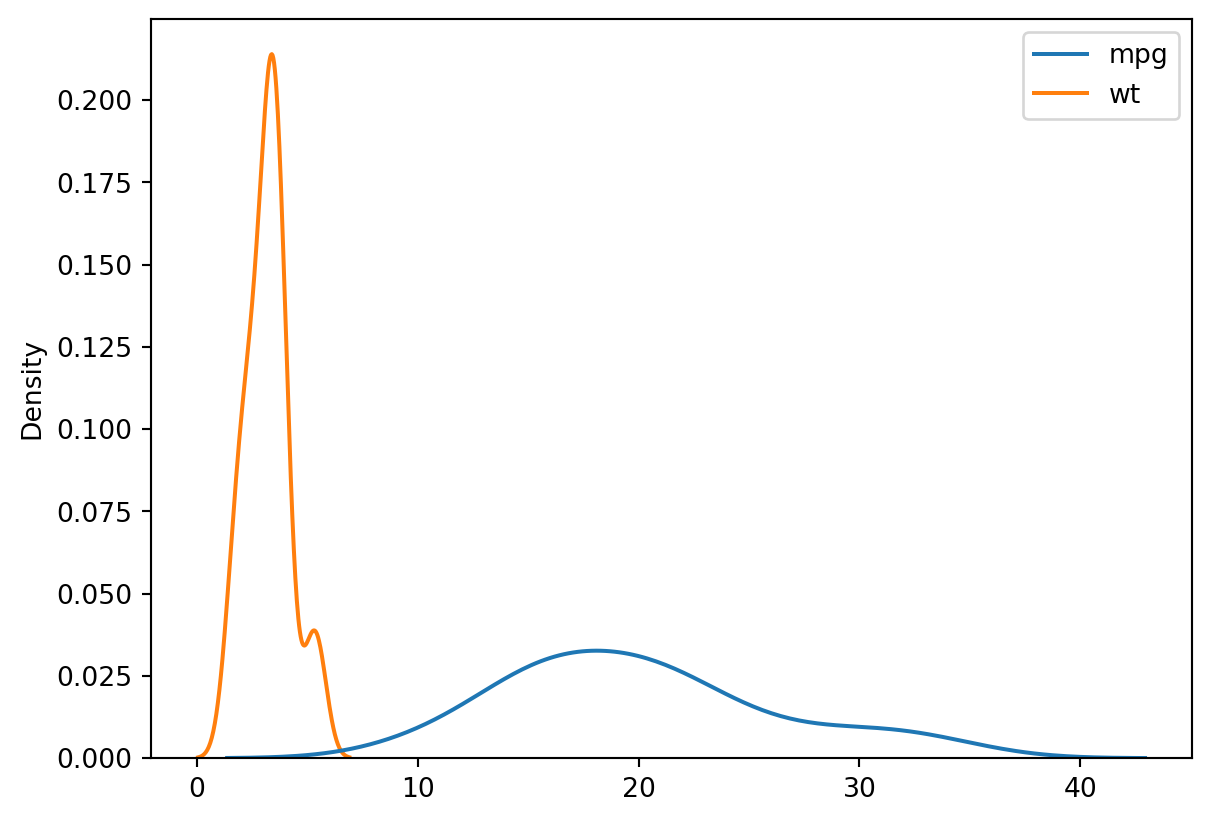
Lineplot
sns.lineplot(df.loc[:, ["mpg", "wt"]])<AxesSubplot: >
Faceting
# create three empty spots
grid = sns.FacetGrid(data = df, col = "cyl", col_wrap=2)

# puts a historgram on each of them
grid.map(sns.histplot, "wt")
<seaborn.axisgrid.FacetGrid at 0x7f5d55cf2590>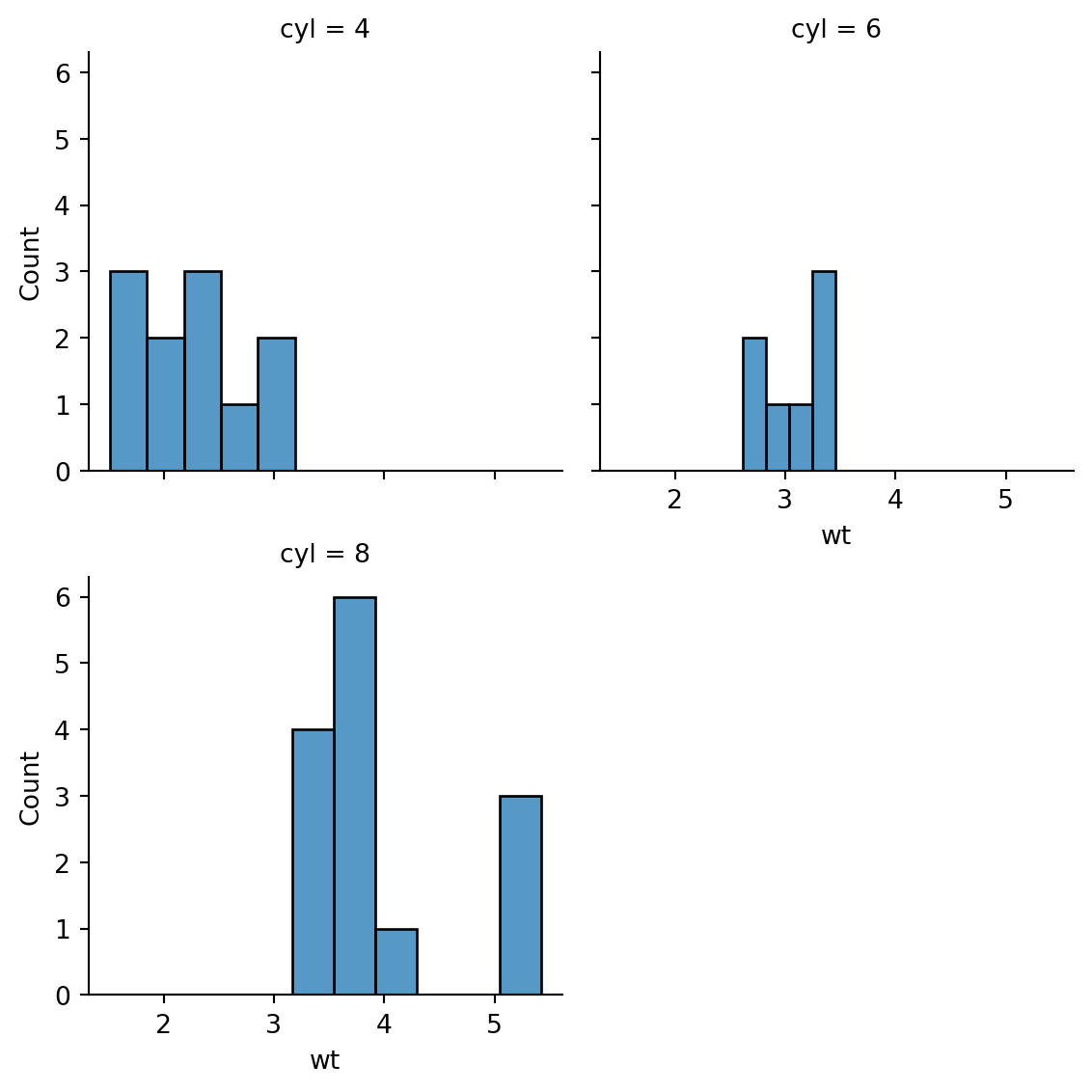
The initial display is automatic. If you want to show the same plot again, access the figure property of the object.
# just typing it out gives the object metadata
grid
<seaborn.axisgrid.FacetGrid at 0x7f5d55cf2590>grid.figure
Tweaking Plots
Axis Labels
The plot we made of weight and mpg had mostly unusable x tick labels. Let’s revist it.
p_line = sns.lineplot(df.loc[:, ["mpg", "wt"]])
p_line.figure 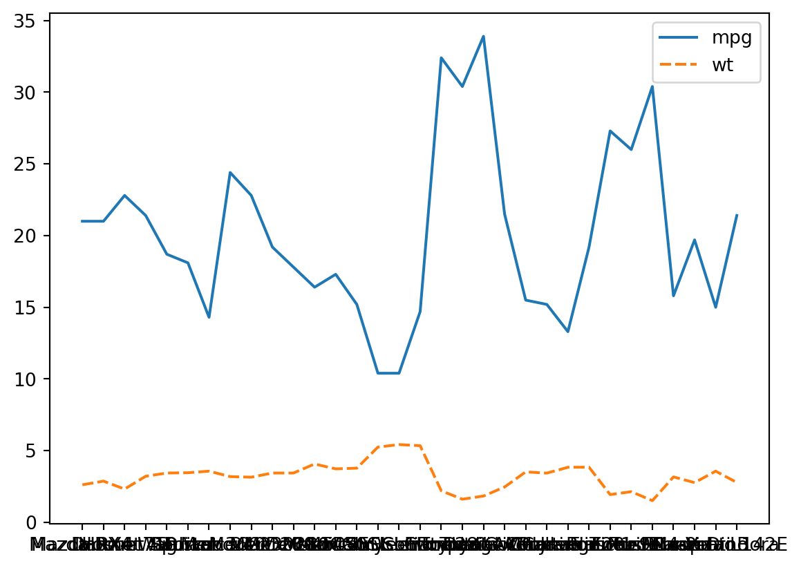

The syntax is a little awkward. Essentially there is a set method, and you use a get method to retrieve the labels to pass into it, specifying a rotation.
# set what you get from the get method v--here
p_line.set_xticklabels(p_line.get_xticklabels(), rotation = 45)
p_line.figure
/tmp/ipykernel_9407/667538073.py:2: UserWarning: FixedFormatter should only be used together with FixedLocator
p_line.set_xticklabels(p_line.get_xticklabels(), rotation = 45)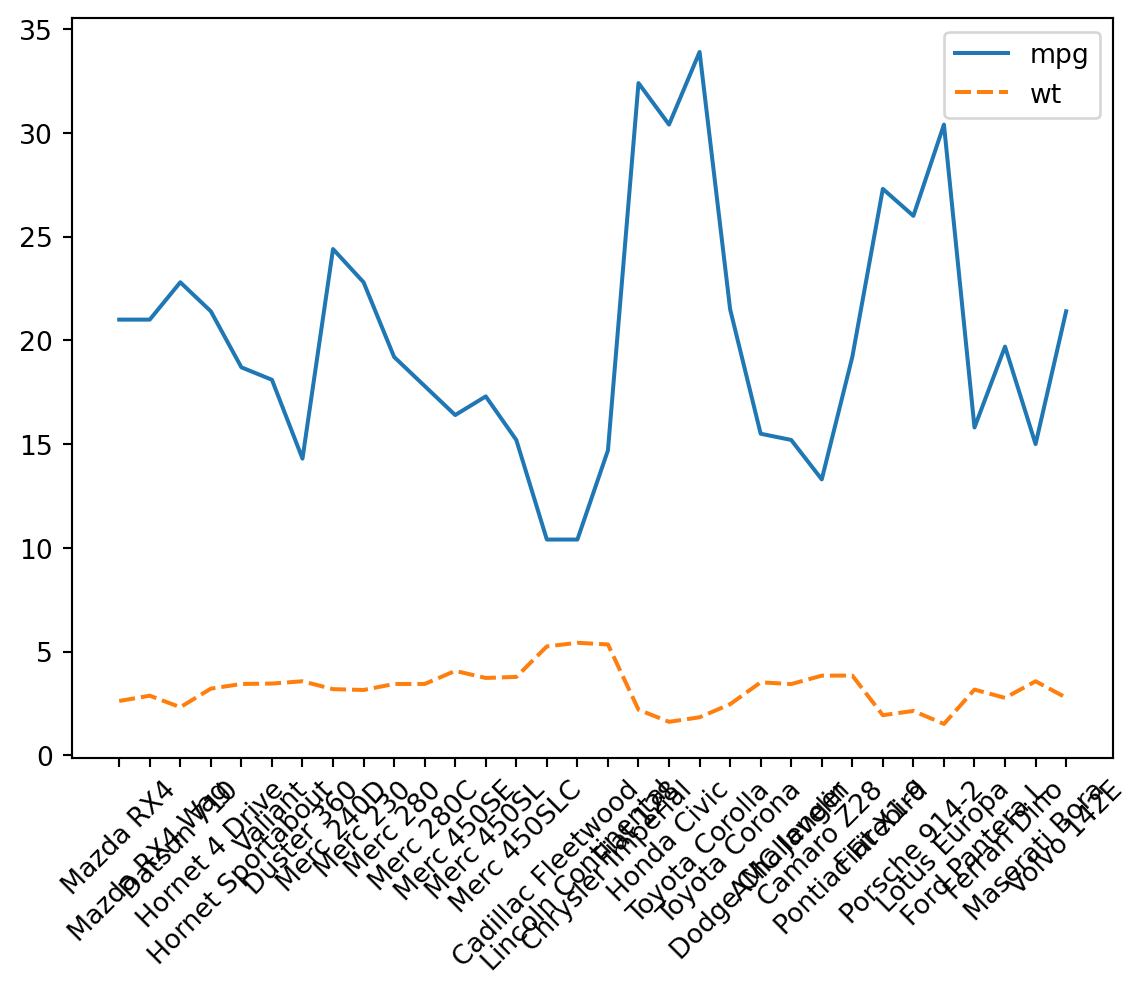
They still conflict a little. We can make them a little smaller overall. The technique is the same, just setting a different property.
p_line.set_xticklabels(p_line.get_xticklabels(), size = 5)
p_line.figure
/tmp/ipykernel_9407/3729791072.py:1: UserWarning: FixedFormatter should only be used together with FixedLocator
p_line.set_xticklabels(p_line.get_xticklabels(), size = 5)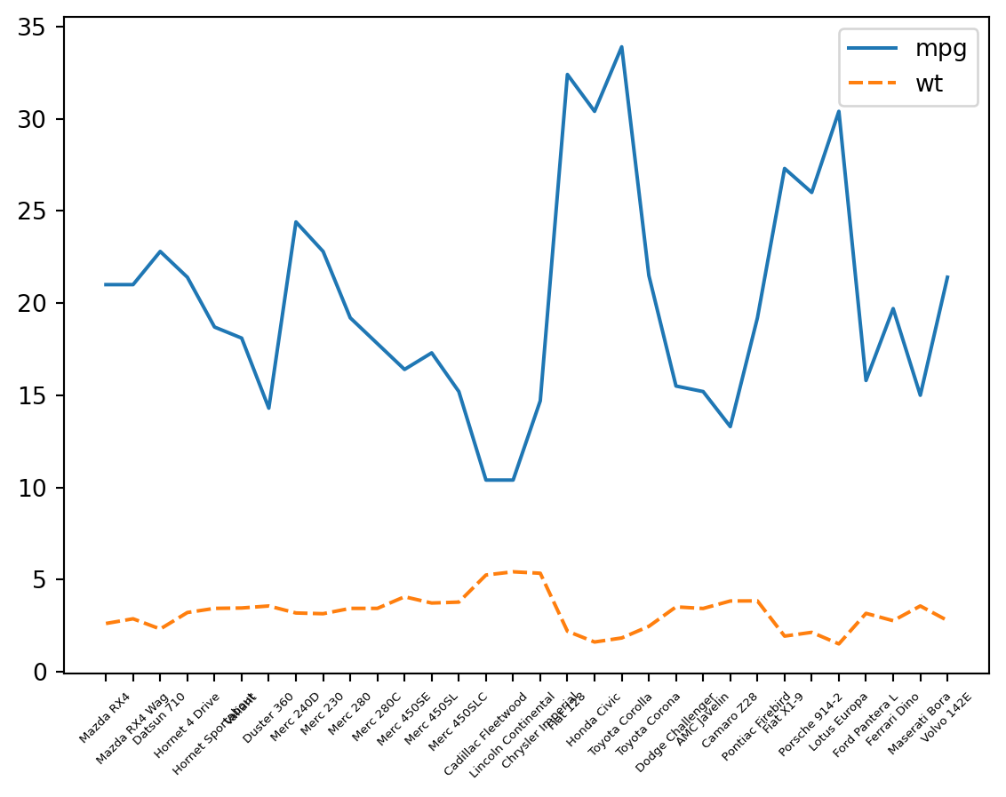
Title
p_line.set(title = "0_o")

p_line.figure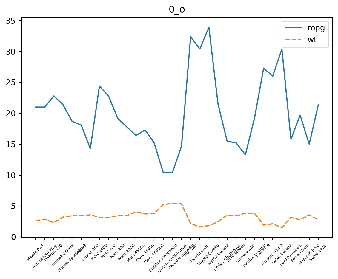
Color Schemes
Discrete
Seaborn lets you preview color palettes by calling them as a function argument to sns.color_palette.
sns.color_palette("dark")The plotting functions will then have arguments for color scheming:
p_box = sns.boxplot(df, x = "cyl", y = "mpg", palette = "dark")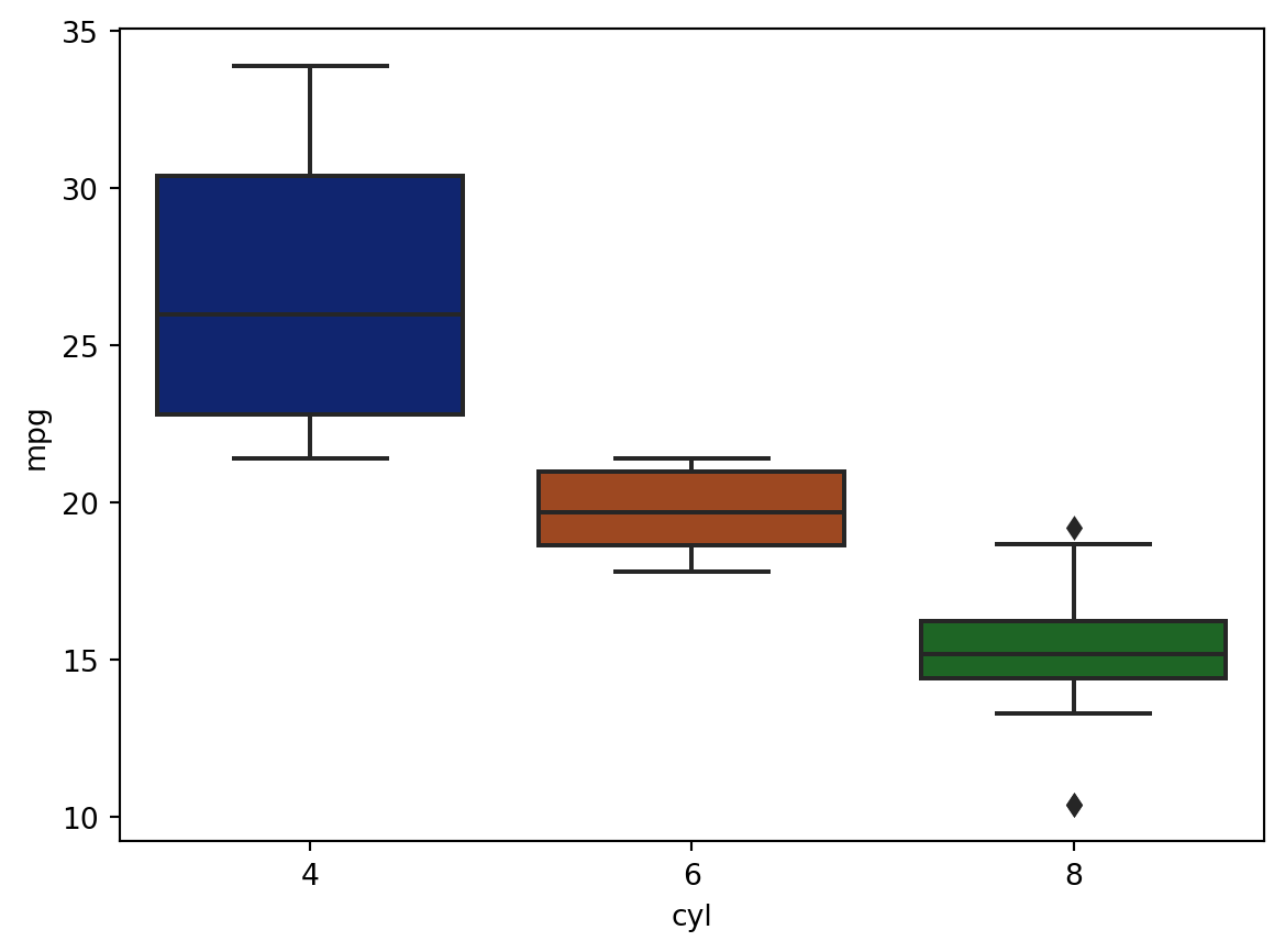
Continuous
sns.color_palette("mako", as_cmap = True)mako

under
bad
over
sns.heatmap(df[["disp", "hp"]], cmap = "mako")<AxesSubplot: >